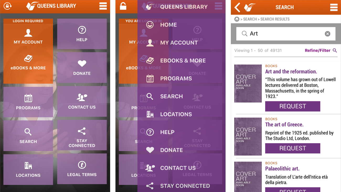
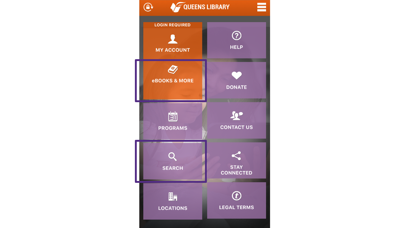
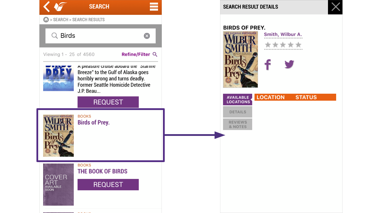
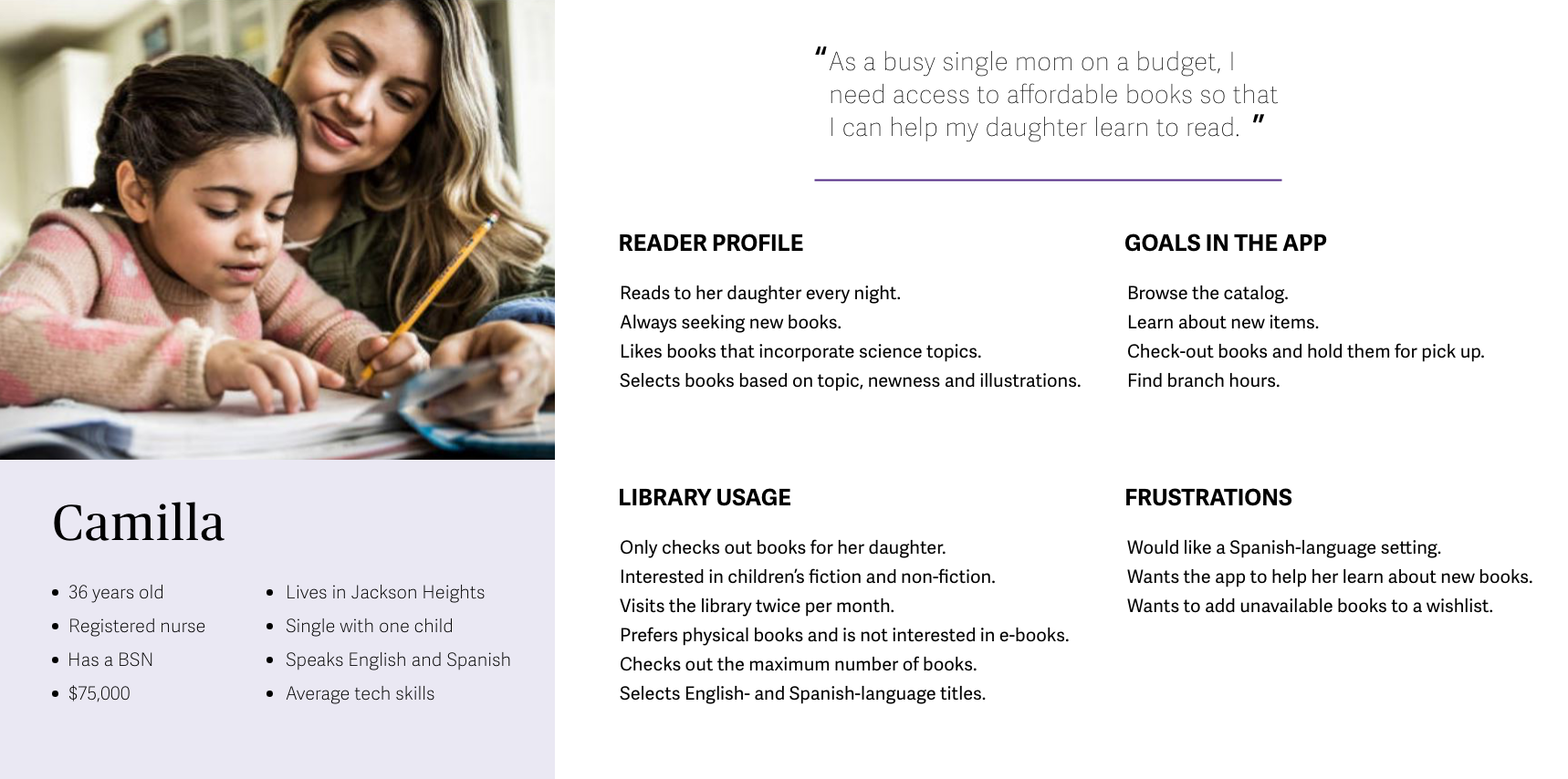
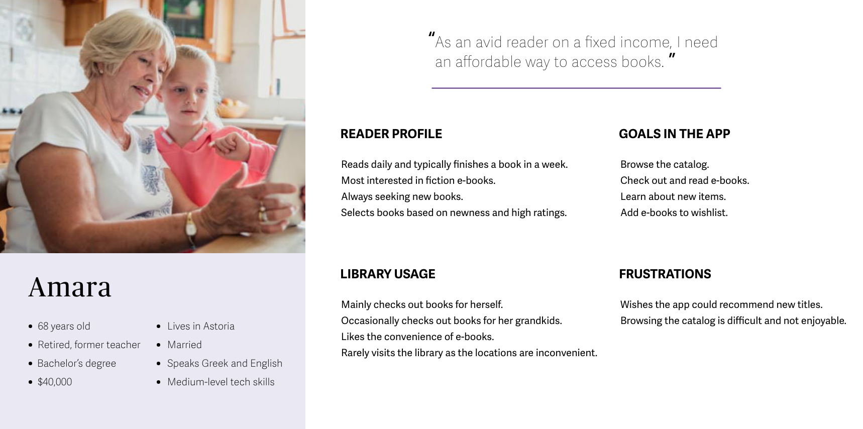
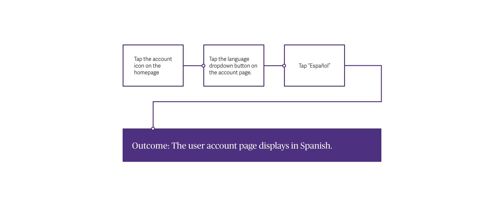
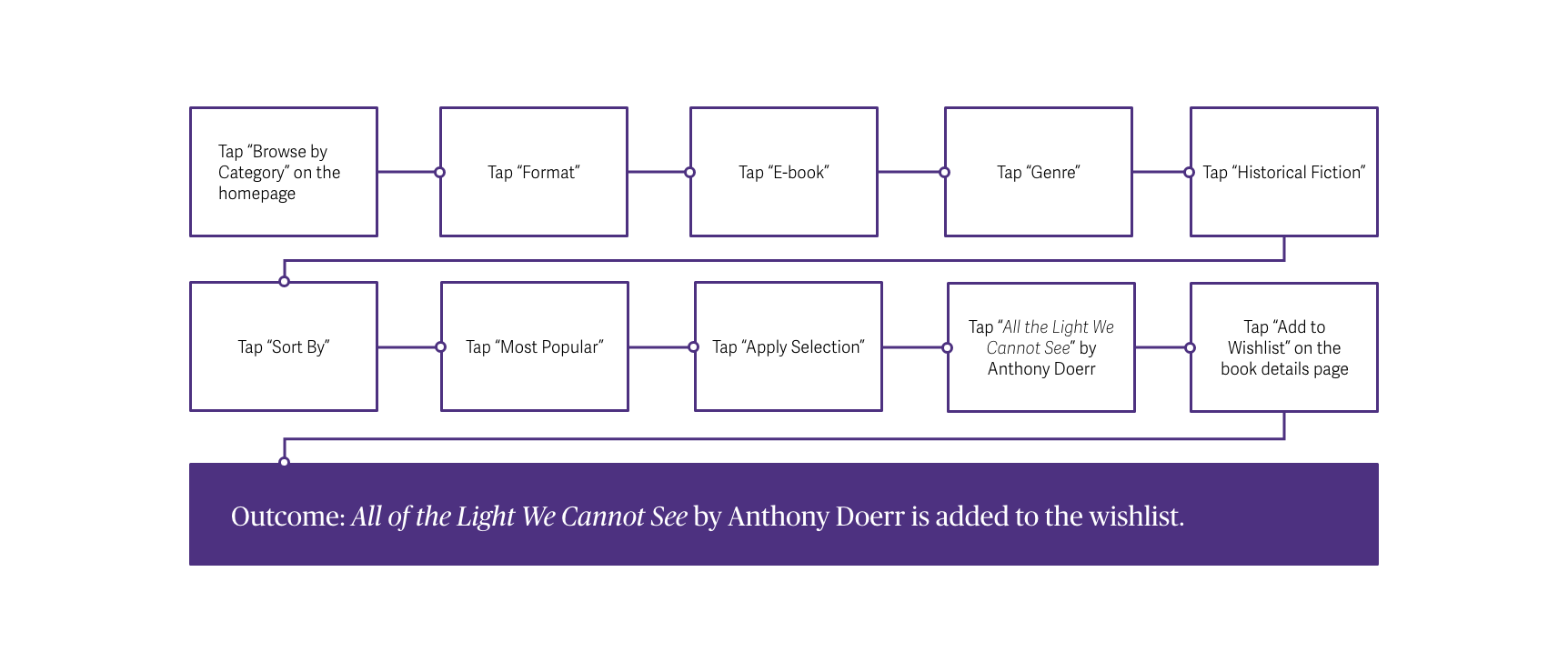
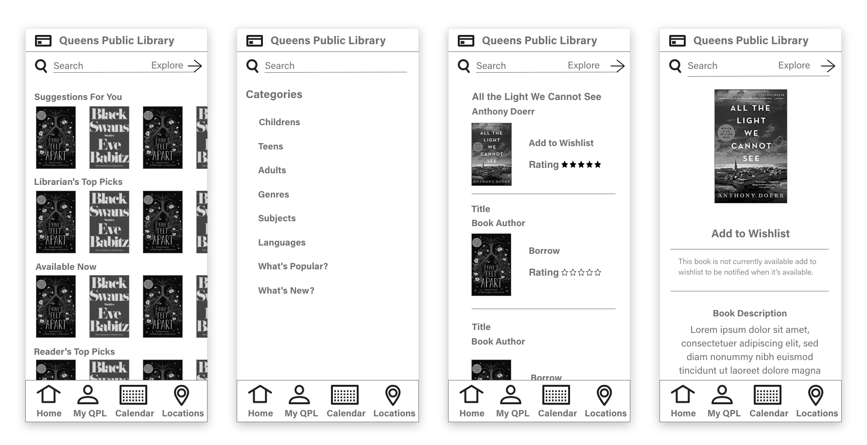
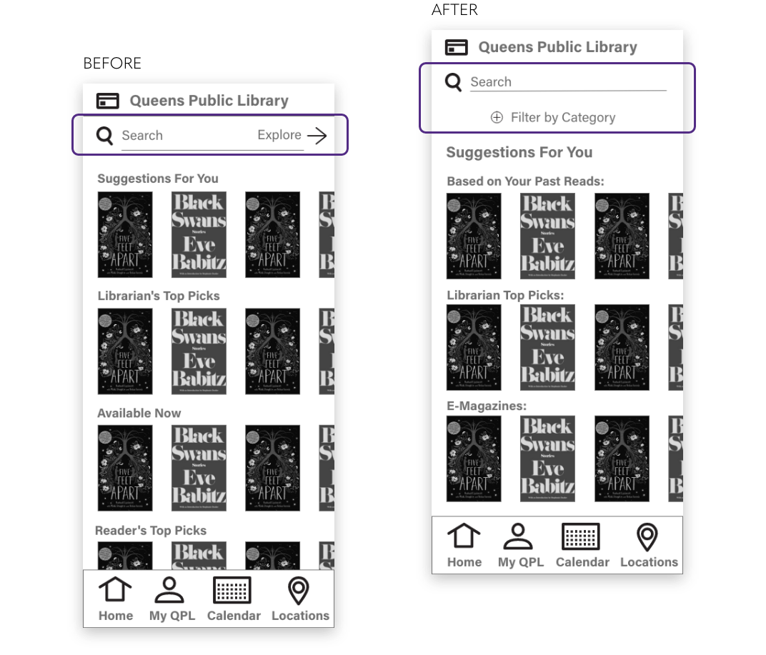
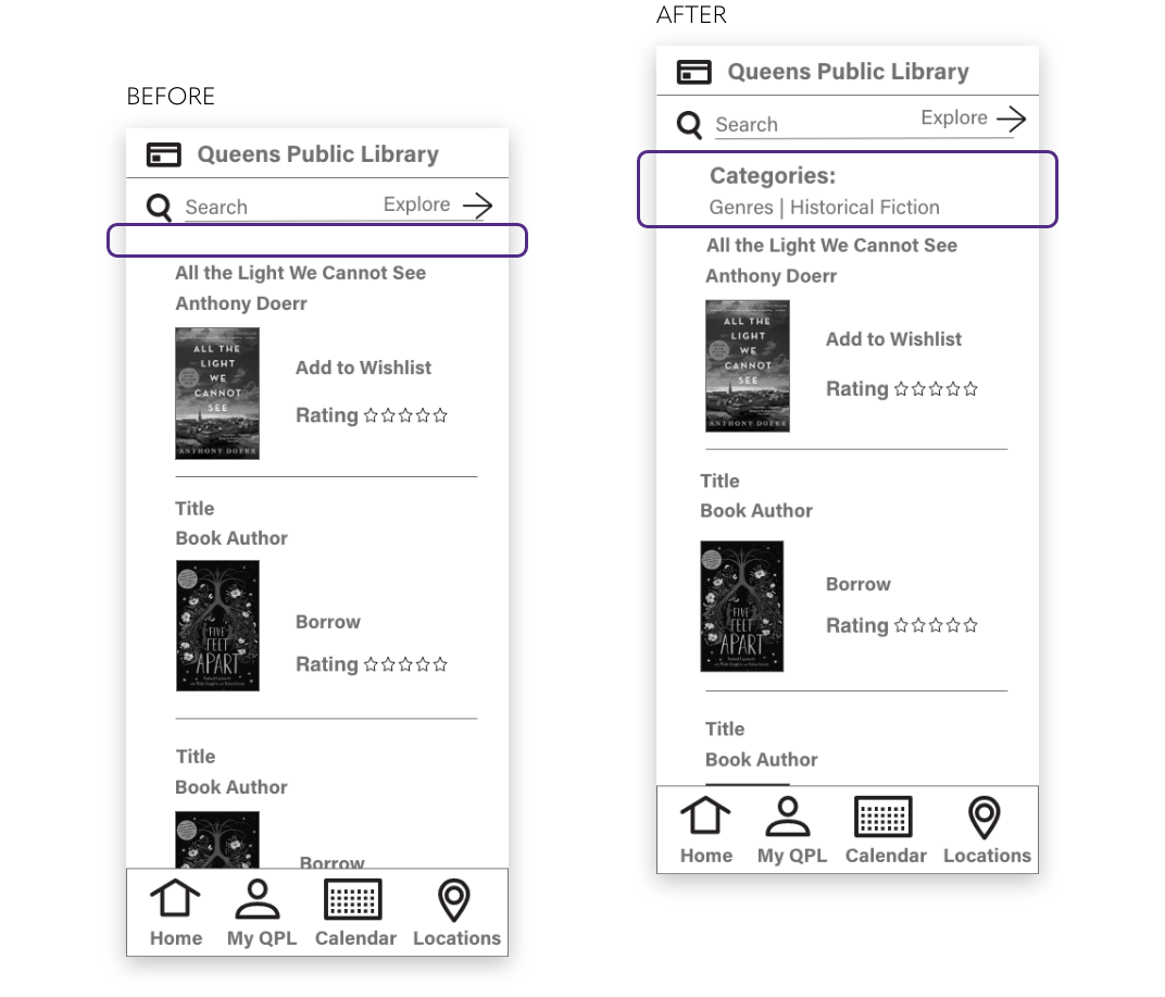
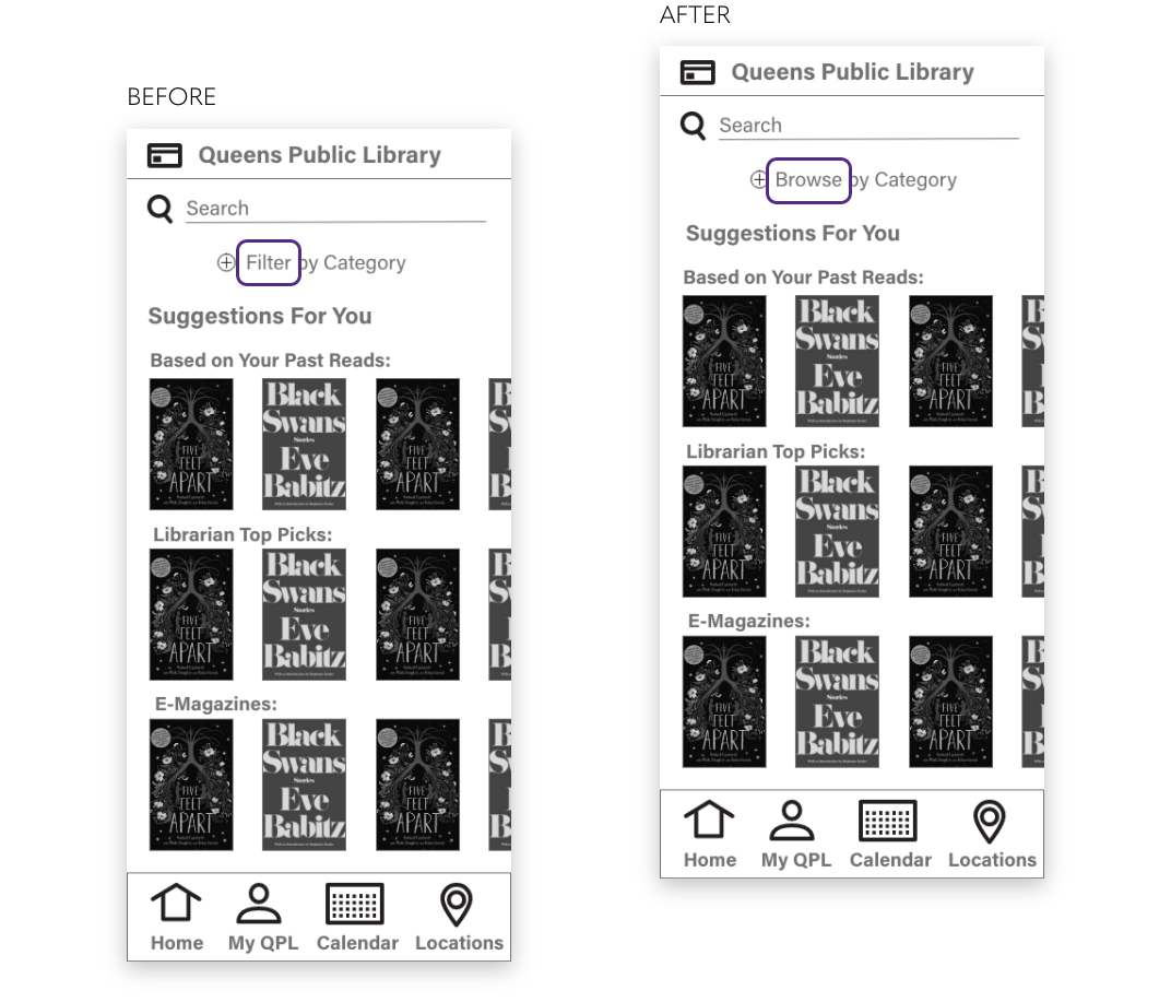
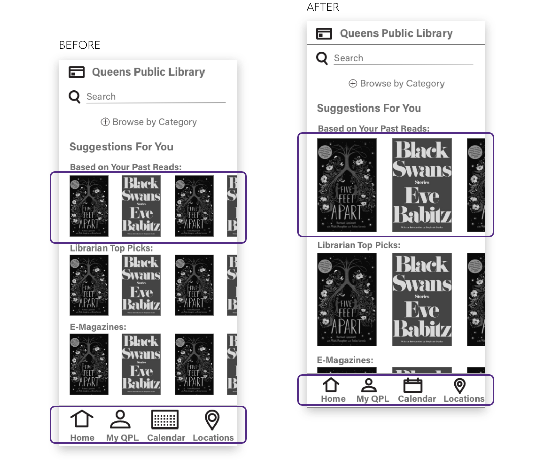
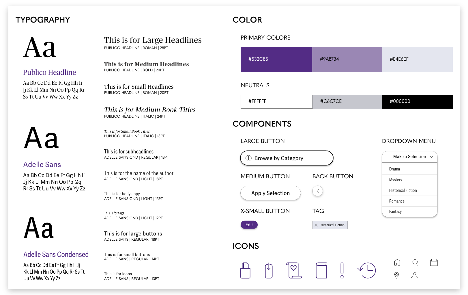
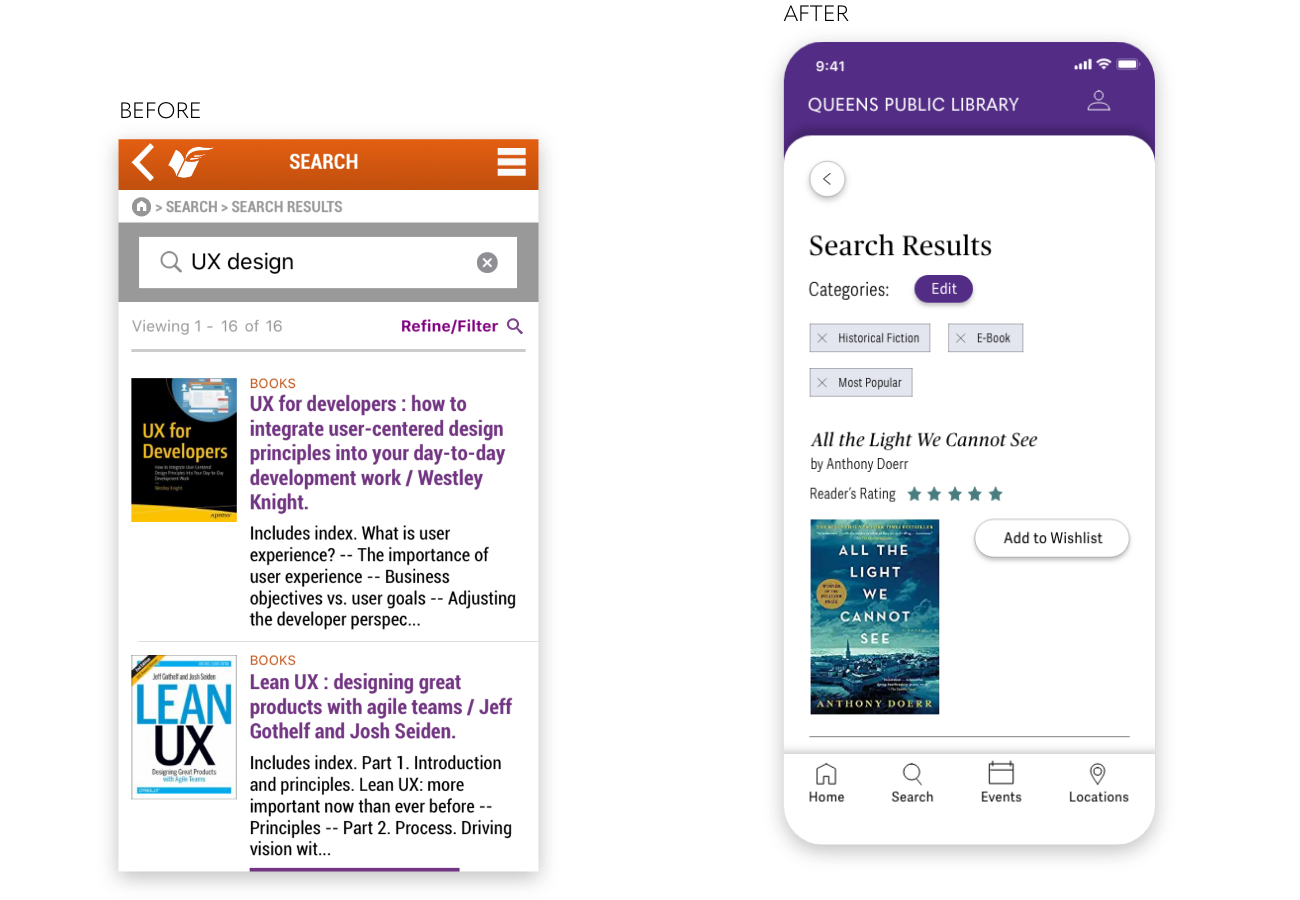
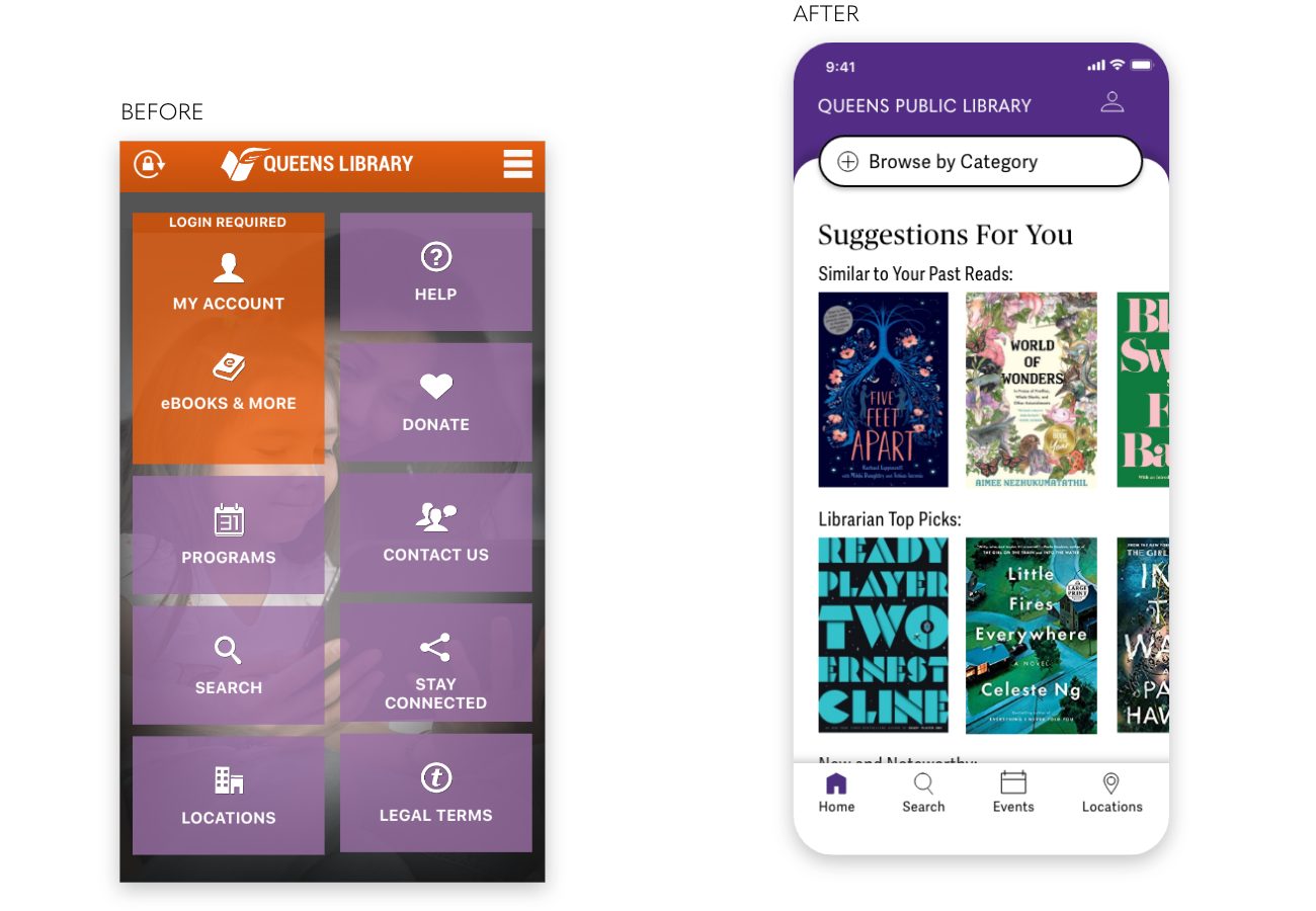
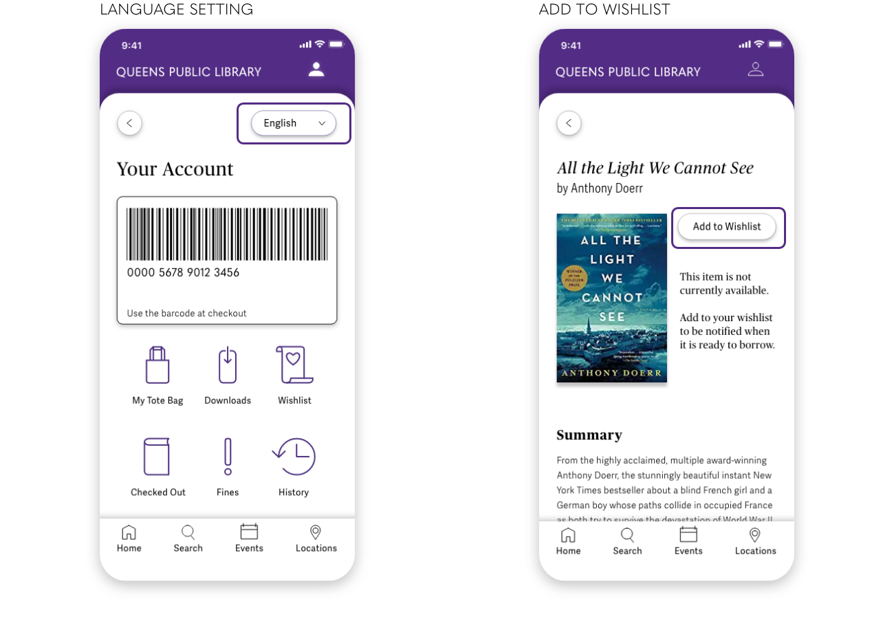
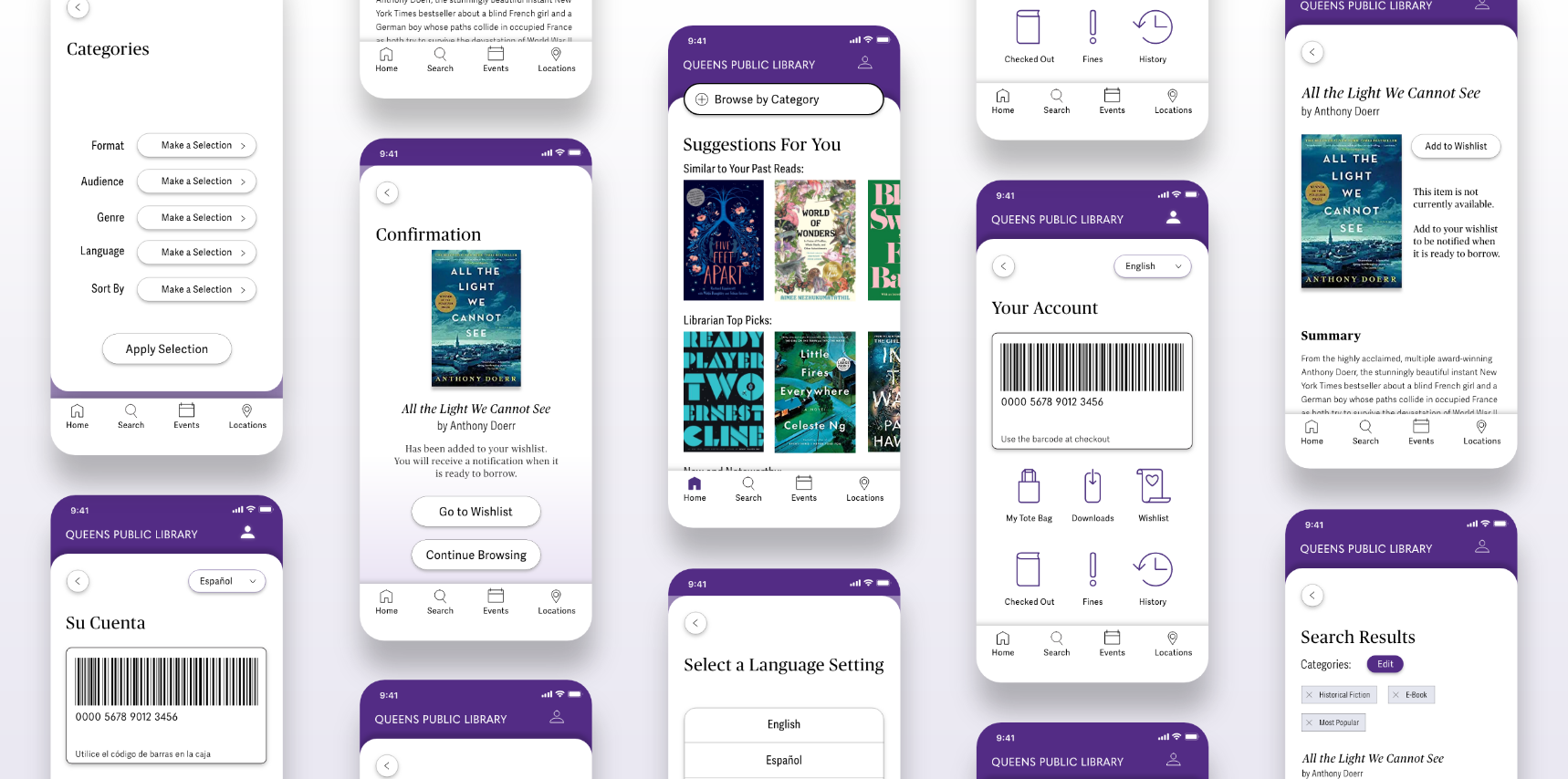
The Queens Public Library (QLP) app allows patrons to search the catalog, reserve books, find programming and look-up local branch hours. The original app looked dated, and basic tasks, such as searching the catalog, were cumbersome. I conducted a heuristic evaluation and researched library industry reports to identify three main redesign goals. I then interviewed users, drew wireframes, tested my prototype and created an updated design system for the final high-fidelity version.
September 2019 - December 2019
At the time of my research, QPL had recently updated their tagline to "We speak your language." The library chose this slogan to reflect the diversity of languages spoken by their patrons. As part of this campaign, library branches invested in tablets loaded with Google Translate to help staff communicate with non-English speakers. Given the library's emphasis on connecting with the whole Queens community, it seems appropriate for the QPL app to offer a way to change the language setting.
I conducted three interviews, two with QPL patrons and one with a UX designer who an avid patron of her local California library. During the interviews we walked through a scenario of requesting a book from the QPL app. My questions focused on how the interviewees felt about the process, the type of materials they would check-out, and their general feelings about QPL and public libraries. These discussions were imperative for finding pain points and understanding their expectations for the app.
I constructed two personas that were reflective of the QPL target audience research and user interview results.
Camilla wishes to change the language settings of the app to Spanish. Although she is fluent in English, her preference is to look through the QPL app in Spanish.
Amara is unsure which book she would like to read, but does know she is interested in a historical fiction novel. She would like the app to recommend relevant titles to her.
After identifying two tasks important to the app users, I moved on to the initial design and testing.
Next I tested the medium-fidelity prototype. Participants were asked to complete Camilla and Amara's user flow tasks.
The difference between “Search” and “Explore” was unclear. These two buttons read like a single button. Participants were also uncertain about the functionality of the "Explore" button.
I changed the label of "Explore" to "Filter by Category" to better align with the button function. This was placed underneath the search bar to create distinction.
The explore results page did not specify which categories users had selected.
A section was added at the top to display the user's selections.
I created a high-fidelity prototype with Adobe XD. The following videos show the steps users would take to complete the user flow tasks.